Yarra Valley Water · Product Design
My Account redesign
A complete redesign of the customer portal to make it easier to manage bills, payments, and usage.
Overview
Putting customers in control of their water accounts
Yarra Valley Water needed to modernise its customer portal to align with its digital strategy and meet the needs of an increasing digital-first community.
I led the UX design of key billing, payment, and usage features to help customers self-serve with confidence, while supporting the business’ shift toward digital operations.
Key outcomes:
30% reduction in customer service calls during hypercare
Easing pressure on front-line teams
15% increase in instalment based plans
To help financially vulnerable customers.
24% increase in uptake of Direct Debit
Leading to fewer late payments and improved billing efficiency.
18% decrease in late payments per quarter
Supporting revenue consistency in the business.
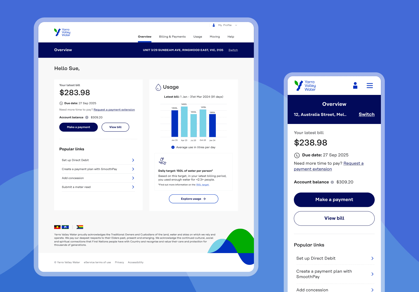
Before
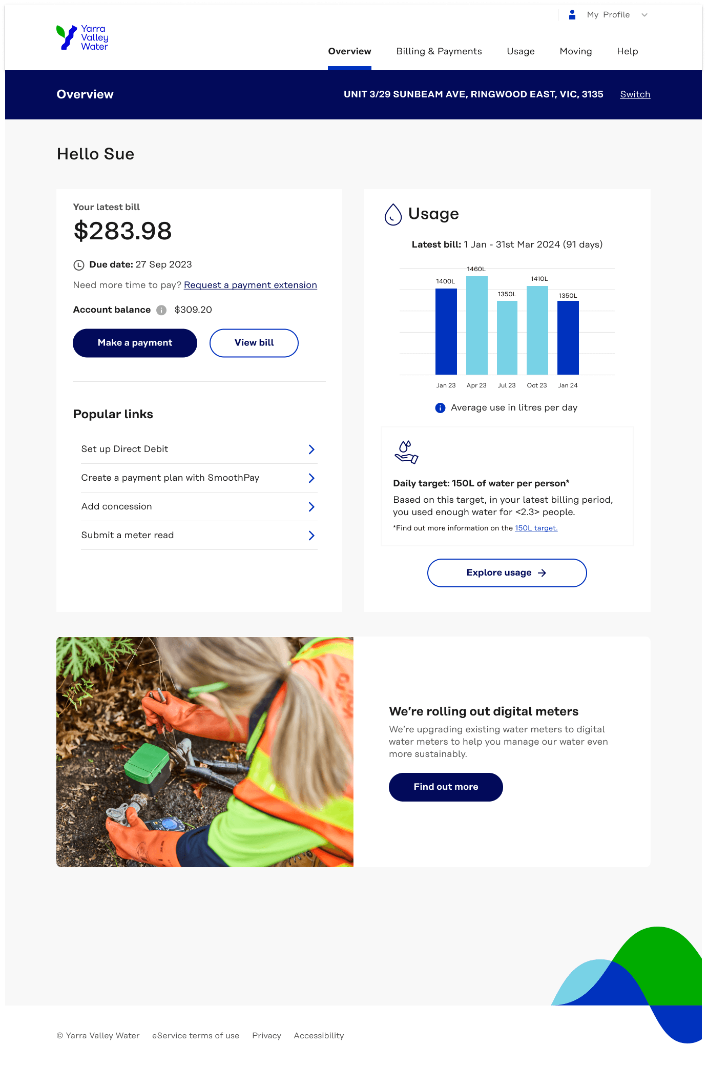
After
My role
Designing at the intersection of legacy, strategy, and customer experience
As the sole UX designer on the delivery team, I led the redesign of core flows across billing, payments, usage tracking, and profile management.
I worked closely with developers, business analysts, and product owners to ensure we designed usable, scalable solutions within the limitations of legacy infrastructure. This meant translating business rules into step-by-step, accessible interfaces, and making complexity feel simple for our customers.
Discovery
Turning customer insights into a phased, impact-driven rollout strategy
When I joined the project, discovery had already been done, but I knew we couldn’t move forward without deeply understanding the existing pain points. I reviewed existing customer research, deep-dive into the legacy portal, and insights from internal teams like customer service and billing.
What stood out:
Customers struggled to set up or change payment methods, leading to missed bills and calls to support
Usage data was hard to access and interpret, making it difficult to manage consumption or spot issues
Many accounts were shared (e.g. landlords, family, property managers), but the platform didn’t support this reality
These insights shaped how we prioritised the roadmap and designed the experience.
Insights
Feature roadmap shaped by insights
We structured the redesign into phased beta releases, allowing us to deliver customer and business value early, while managing delivery risk.
Key features
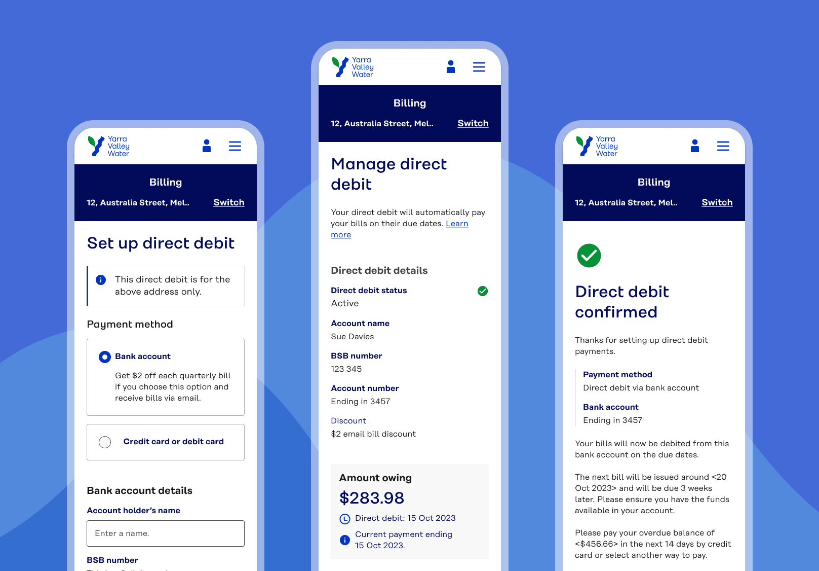
Direct Debit
A set and forget solution for bill payments
We simplified the Direct Debit setup to make it easy for customers to pay bills automatically, without the stress of missing a payment.
Working within existing system constraints:
Streamlined the flow for quick setup
Included and incentive to sign up to email bills to reduce paper waste within the set up flow
Designed a smooth, mobile-friendly experience
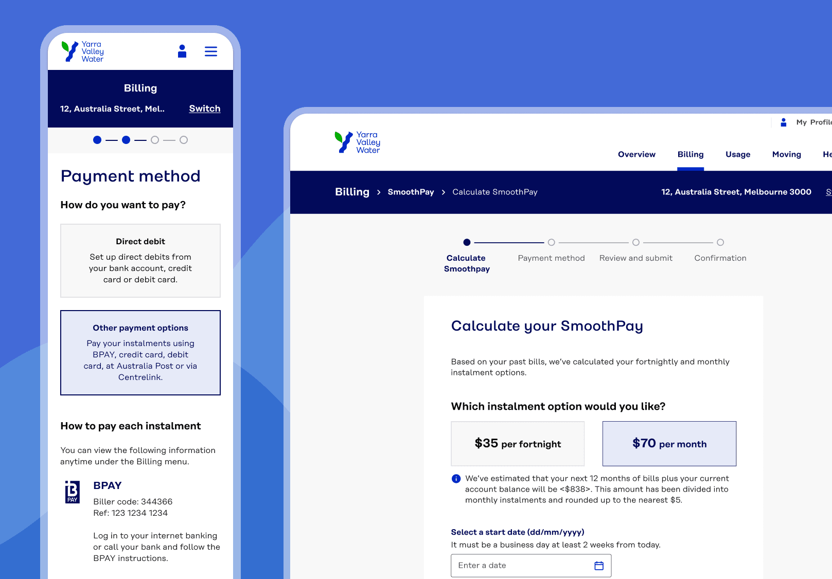
Flexible payment options for our most vulnerable customers
Managing large water bills can be stressful, especially for vulnerable customers. We redesigned SmoothPay to be easier to understand and register for, using clear steps and helpful content to reduce support calls and guide users through the process.
A rigid business process made this tricky, so we focused on:
Breaking down complex flows into simple steps
Adding timely content to explain and reassure
Creating a smooth, user-friendly experience despite backend limits
Learnings
One of the biggest takeaways was learning how to improve the user experience within rigid business processes that weren’t going to change. Instead of trying to redesigning systems and processes, I focused on designing around it which included simplifying steps, working with content to clarifying language, and guiding users through the complexity in a way that felt effortless.
Designing at a water utility came with significant constraints. Business processes couldn’t be rebuilt from scratch, and legacy technology meant tight boundaries on what could be delivered.